Avenir - A Futuristic Approach

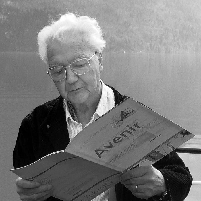
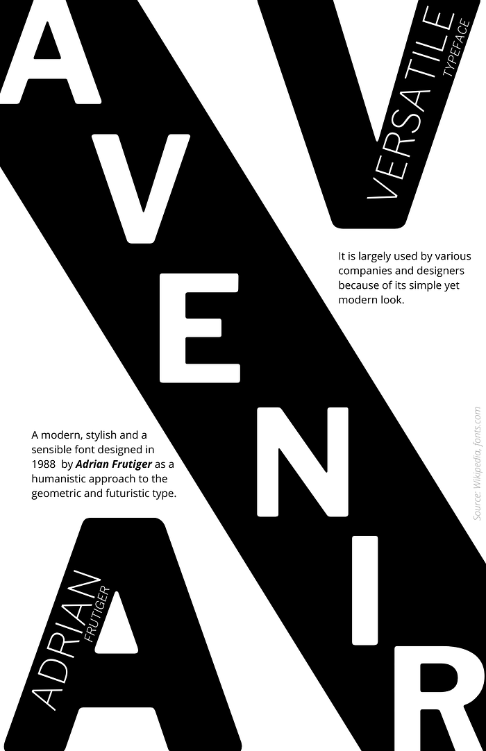
In 1988, Avenir was designed by Adrian Frutiger, who was greatly inclined to the sans serif typefaces. This typeface is a combination of two modern typefaces, Futura and Erbar. This inspiration from geometrical style typefaces led to the name of Avenir, which in French stands for “Future.” It was originally released with three weights and later was expanded to six weights. This indeed relates to the idea of eternality in the future of the typefaces. Various companies have largely adopted it, like Dwell Magazines, Key Bank, Banrisul, Susquehanna, Japan Airlines, and many more. LG Electronics extensively use this typeface in its various domains.
Avenir portrays an organic representation of the geometric style where it has a bigger x-height, and the apertures are bigger than the older fonts. The descenders of letters j and y are curved, and the letter Q sports a horizontal tail. Although it is usually classified geometric style typeface, it is evident that it is not purely geometric. There are a few vertical strokes that are thicker than the horizontals. Avenir is usually related to a modern, sensible and stylish typeface.

